Sunday, September 25, 2011
Flow Map
A flow map is a type of map that shows the movement of something from one place to another. These maps are used on a day-to-day basis to exhibit many different types of information. For example, many airlines use a flow map to show the different locations to which their company flies. The more lines pointing to a location, the more flights that location receives. Flow maps can basically be used to depict anything that moves from one location to another. The picture above is an example of a flow map that displays traffic. The lines near the big cities become darker showing the increased traffic in those areas.
http://mundi.net/maps/maps_014/
Histograms
Histograms are a type of map that is used to organize data. The data is organized into a bar graph to allow easy analysis. There are many different options for the variables on a histogram, but the data is usually numerical. The horizontal axis usually contains the independent variable and the vertical axis usually contains the dependent variable. The example histogram showed uses the variables of score on a final exam verses number of students who received this score.
http://searchsoftwarequality.techtarget.com/definition/histogram
Mental Map
A mental map is a map that is made by an individual based on his or her own thoughts. Most mental maps, when drawn, show an emphasis on certain landmarks or areas that are important to the individual who designed the map. These maps can be useful when trying to describe locations or directions to a certain area. In the picture of the mental map, locations such as school, the designer’s home, and church are emphasized. This implies that these locations are important to the designer.
http://mentalcharlois.wordpress.com/tag/mental-mapping/
Sunday, September 18, 2011
Climograph
A climograph is a graph that is used to show the range of monthly temperature and precipitation for a certain location. Travelers or people looking for information about a specific location most frequently use these maps. The map allows the viewer to develop an idea of what the weather is like for a certain period. Awareness of what weather to expect can help with travel plans or even moving plans. I am in the process of applying to dental school. I have never been to Phoenix, Arizona, but I did apply to two schools located there. I had always been told that the weather is quite moderate and there is not a lot of rain. The maps, such as the one shown above, would illustrate the weather that I can expect during the months I would be there.
http://www.usclimatedata.com/climate.php?location=USAZ0166
Population Profile
A population profile is a type of map that is used to show the demographics of a population. The map shows an analysis of the number of people in a location as a function of their age. These maps can then be used for statistical conclusions for the locations being measured. The picture above shows a population profile of Ketton. As one can see from the map, the largest part of the population in Ketton consists of people between the ages of 34-54 followed by the second highest being people between the ages of 55-64. If one were to look at this population profile, conclusions could then be made for statistical data. The map could also be used to help with attraction building. Due to the fact that the population can be classified as middle age adults, attractions should be placed in Ketton that attract an older crowd rather than, for example, a bar that attracts young adults who make up the smallest part of the population.
http://www.rutnet.co.uk/pp/gold/viewGold.asp?IDType=Page&ID=13868
Propagana Map
A propaganda map is a map that is used to portray or convince people of an idea. Propaganda maps can be considered to be a type of arbitrary cartography because one can design the map to specifically show a particular opinion. Propaganda maps have been used throughout history and have proven to be very successful. The map shown below is a propaganda map of Florida. The map portrays the positive attractions of Florida, such as the beaches, certain animals such as dolphins and pelicans, and even a space ship to show where Kennedy Space Center is located. If someone who has never been to Florida and knew nothing about the state were to see this map, they would believe that Florida is the ideal place to travel. Notice the designer’s propaganda map is trying to portray Florida in a positive manner, and has purposely failed to display thunderstorms and hurricanes, even though these are a common occurrences.
http://www.rainbowcountrytravel.com/florida-fun-spots/
Monday, September 5, 2011
Hypsometric Map
Hypsometric maps are used to show the topography and elevation of the land being displayed. The different types of topography and elevation are represented by different colors and shading. The colors green, beige, yellow, red, and white are most commonly used. The color green represents lower elevations while beige and yellow represent a higher elevation. This type of map is also used to show differences in ocean depth. The darker the color blue the deeper the ocean. The example hypsometric map shows the different levels of elevation in Spain.
http://maps.aridocean.com/
Star Plot
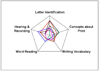
A star plot is a map that is used to show the relationship among different variables. There must be three or more variables being compared. The length of the data line represents the magnitude of the variable. The longer the line the more magnitude the variable has. The example star plot, pictured above, shows the result of a student observation test comparing the variables of letter identification, concepts about print, writing vocabulary, word reading and hearing and recording.
http://assessment.tki.org.nz/Assessment-tools-resources/Alignment-of-assessment-tools-with-National-Standards/Reading/Observation-Survey
Doppler radar
The Doppler radar is a type of special purpose map that is used in weather forecasting. This map displays the weather for Tallahassee, Florida on Monday September 5, 2011. Using the microwaves to track rain or storms, it also portrays the speed the rain is traveling and the intensity.
http://radar.weather.gov/ridge/radar.php?rid=tlh&product=N0R&overlay=11101111&loop=no
Subscribe to:
Comments (Atom)


